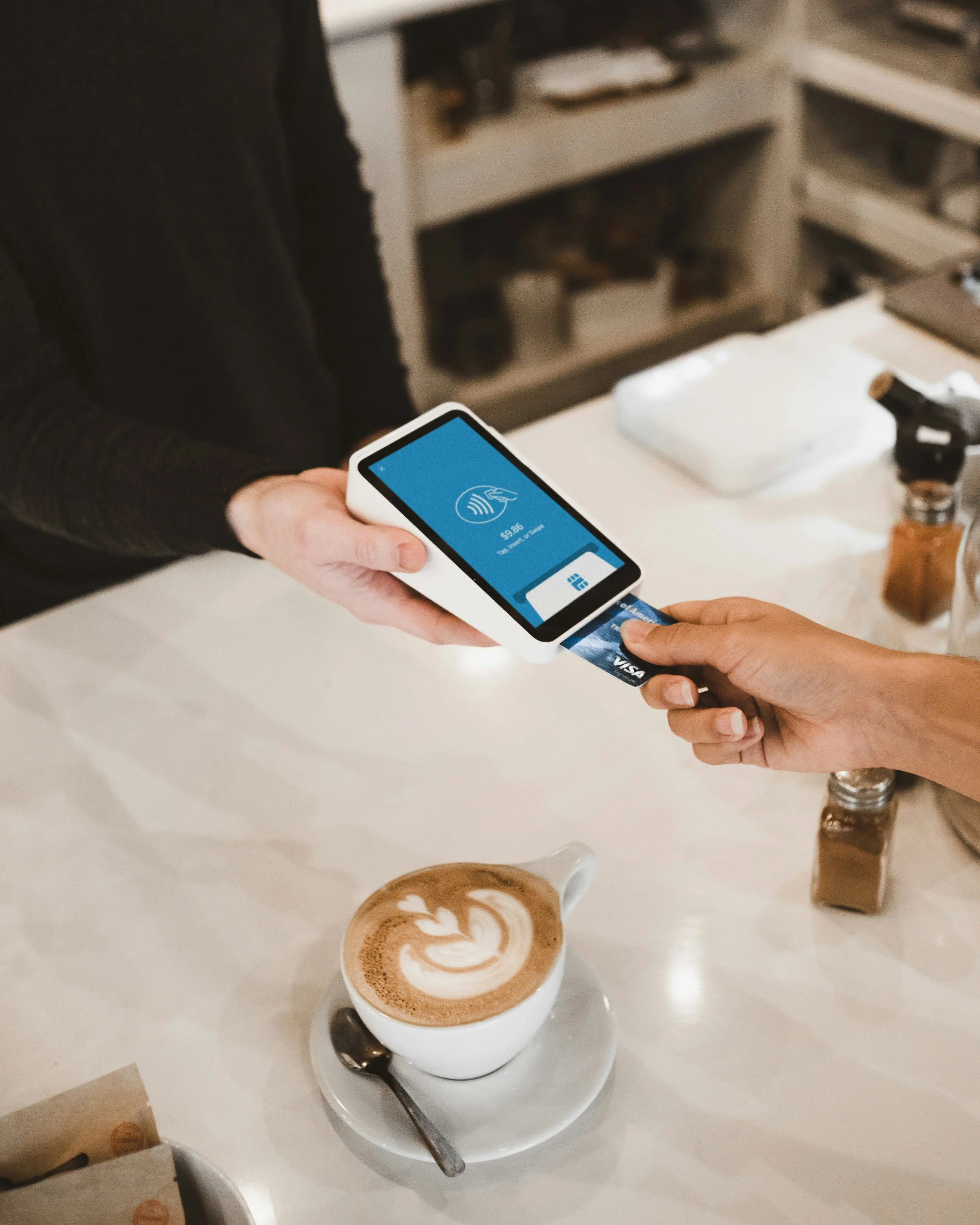
Subscription management made easy
Now available on mobile
Sub$mart
SubSmart is a subscription management service that had gained traction as a web-based platform, but the company wanted to expand its reach to mobile users in hopes of increasing their market reach
This case study walks you through how SubSmart was optimized for mobile

Understanding the Users
SubSmart provided information about their users that they gathered from user interviews
Information about SubSmart users:
Even split between men and women
Mostly over 30 years old
Middle-class
Trying to be more budget-conscious
Goals of SubSmart users:
I want to see all of my subscriptions in one place so that I can get a comprehensive view of my spending on subscriptions
I want to unsubscribe from a subscription so that I can reduce needless spending
I want to be notified if any of my subscriptions are about to be auto-renewed so that I can make a decision about if I want to renew the subscription and continue spending money

Examining Industry Leaders
I studied industry leaders in subscription management to identify what worked and what didn’t
I studied the interfaces of 3 leaders in the subscription management sphere: Trackmysubs, Trim, and Rocketmoney
Doing so uncovered elements that I would like to include in the SubSmart design for mobile, and others that I would not like to include
Elements to incorporate:
Have people input their subscriptions after they create an account and go through onboarding
Give people the option to link their bank account or to input subscriptions manually
Ask about currency when getting information about the subscription
Show the month’s total on the dashboard
Make the pages that collect information about a new subscription feel cohesive and connected
Include option to discontinue by going to the site of the subscription but make this easy to do
Visual to display spending on dashboard
Elements to avoid:
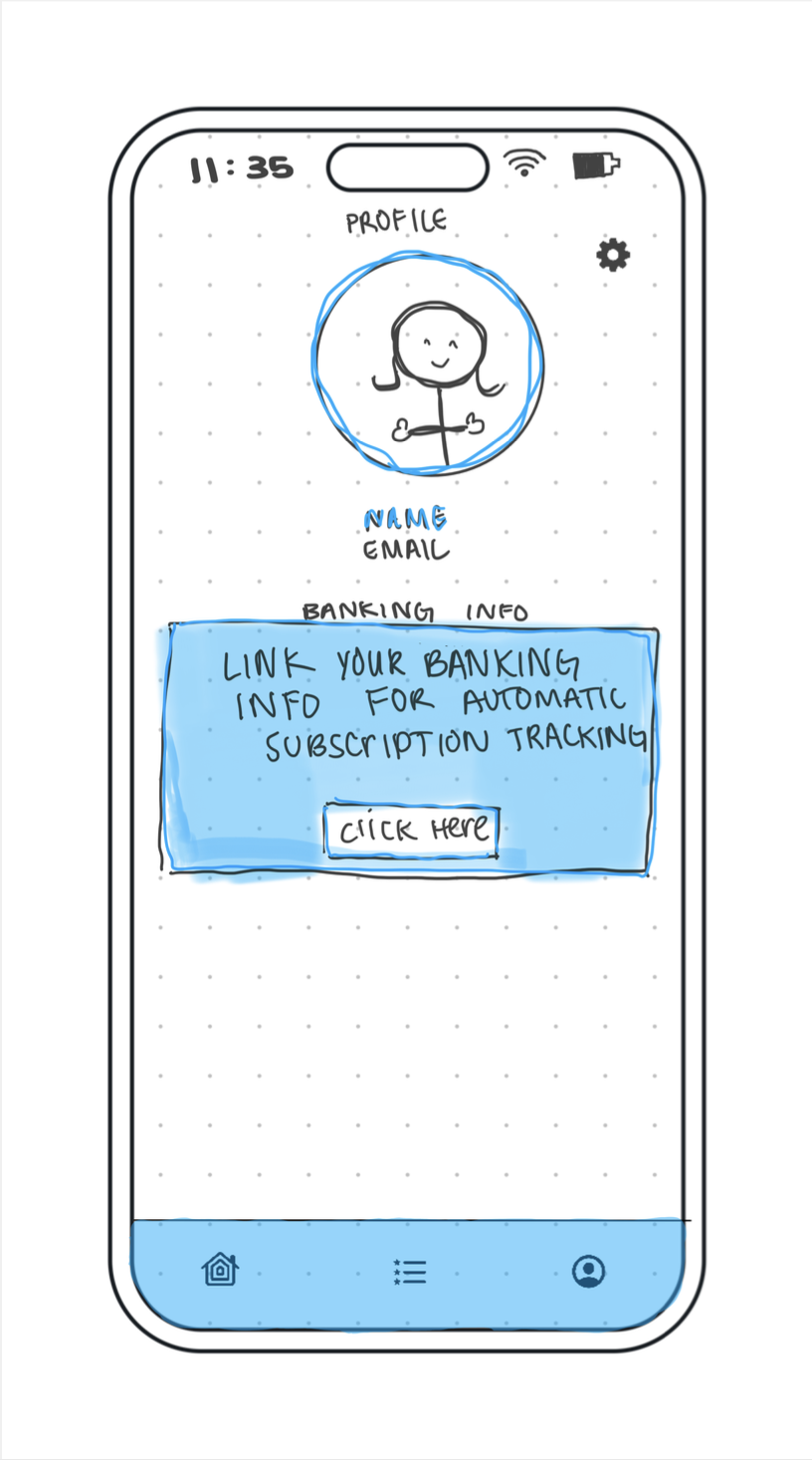
Do not want to force people to link their bank account in order to use the app - especially in the onboarding process. The user should be allowed to link their banking info after the brand has established trust and shown the appeal of providing their banking information

Planning
With this foundational understanding of SubSmart’s users and the competition, I began planning. I created a detailed project timeline and a research plan
Project Plan
The project plan was broken into 3 phases: discover, design, and validate
In each phase I planned what research methods would be implemented to advance the project. Below is the outline of my project plan with justification where necessary
-
Create research plan
Clarifies research objectives and goals
Ensures focused and relevant research
Defines research methods and tools
Establishes a timeline and milestones
Conduct secondary research
Gain context and background information
Understand user needs and pain points
Synthesize research findings
-
Create user flow diagrams
Helps visualize and build how the user will navigate through the app
Helps identify the logical steps required to navigate through content and achieve specific goals
Sketch wireframes
Helps guide digital design
Create a low fidelity prototype
Helps to visualize information architecture
Allows me to focus on core functionality and test to get feedback
-
Write a test script
Conduct usability testing
Helps get feedback on my preliminary designs and lead to iteration that will improve the experience for the user
Synthesize results in usability testing report
Helps summarize the findings from the first round of usability testing and present solutions to the issues that came up during testing
-
Create a high fidelity prototype
Allow me to test the visual design elements on users and it allows them to experience a flow that is closer to the final product. This will help me to identify and fix issues before the app is finalized
-
Write test script
Conduct round 2 of usability testing
Synthesize results in usability testing report
Help summarize the findings from the second round of usability testing and present my solutions to the issues that came up during testing
-
Iterate on high-fidelity prototype
Iteration will allow me to address any remaining usability issues and will help me to provide the best possible mobile experience for the user. More focused feedback from round 2 of testing allows me to focus on specific aspects that need refinement
Research Plan
The research plan provided background information about the project, participant characteristics, and research methods that would be used in addition to outlining the following research objective and research questions:
Research objective: The goal of this research is to learn how the expectations for the mobile interface of the subscription management tool might differ from the web version, and learning about the pain points and needs of users when it comes to mobile subscription management
Research questions:
What are the most common complaints users have about existing subscription management tools?
What are the strengths of other subscription management tools?
How do mobile versions of subscription management apps differ from the desktop versions?
How might user expectations for a mobile version of a subscription management tool differ from their expectations for the web version?

Research
Following the research plan, I conducted secondary research and synthesized this information to inform my next steps
Findings from secondary research:
Complaints about existing subscription management tools:
Security and privacy concerns
Many tools require users to link their sensitive financial info (banking details, cc numbers), exposing this personal data to third parties
Makes the person more vulnerable to privacy risks (data breaches, selling user info, financial hacking)
Difficulty canceling subscriptions
Users often struggle to cancel subs due to the process - often involves multiple links/steps
Many companies employ dark patterns that intentionally complicate the cancellation process, causing frustration
Automatic renewals w/o notification
Subscription services often renew w/o adequately notifying the user, leading to forgotten charges
Strengths of existing subscription management tools:
Bank account independence
Some tools don’t require users to link their bank account
Provides an alternative for users who are wary of exposing their sensitive financial data
Flexible input options
Tools that consider currency allow the app to be used more easily in other countries
Organizational features
Allowing users to group subscriptions into folders and visual displays of subscription data allows users to categorize and track their subs
Simplified discontinuation
Some tools make cancellation easy and clear, which reduces frustration and the amount of effort required to cancel
Differences between mobile and desktop:
Screen space
Mobile interfaces are simpler and more streamlined due to limited screen space
Mobile relies on vertical scrolling instead of multi-layered navigation
Native device features
Mobile apps can utilize the device’s features (push notifications, GPS, mic, camera) which offers more dynamic interactions and enhances the user experience
User expectations for mobile VS web:
Experience
Mobile apps provide a more immersive and interactive experience than web
More convenient, accessible, and good for use on-the-go
Speed and performance
Mobile apps are expected to load faster than web
Device integration
Mobile apps can utilize device features (push notifications, GPS, camera) which helps to tailor and personalize the experience to the user
Personalization
Mobile is expected to be more personalizable
Key takeaways for the design of SubSmart app:
Cancellation made easy
Streamline the cancellation process
Utilize device capabilities
Use push notifications to remind users of upcoming renewals or cancellations
Focus on user control
Allow users to group their subscriptions, allow users to change the currency, give users the option to link their banking information, etc

Building the experience
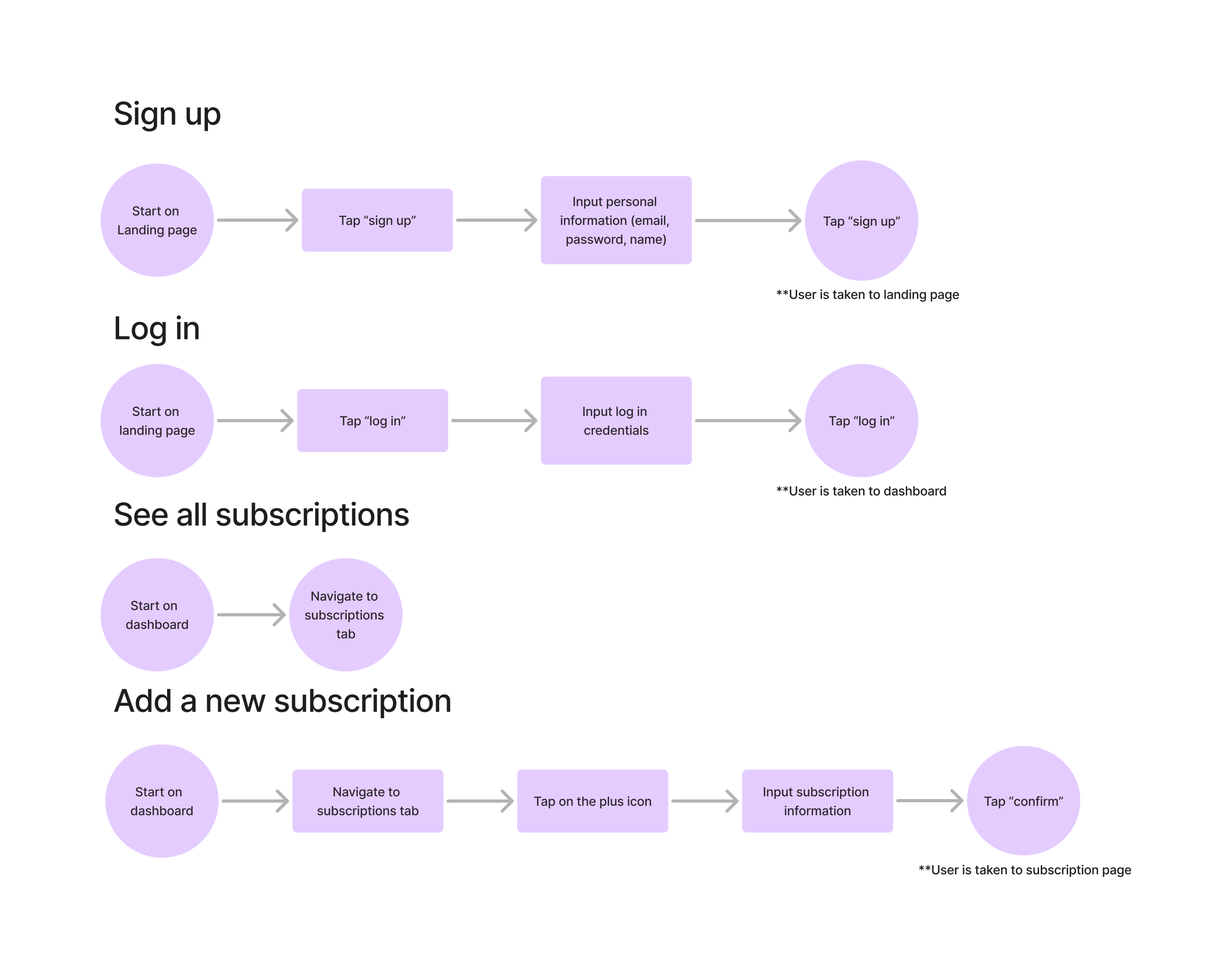
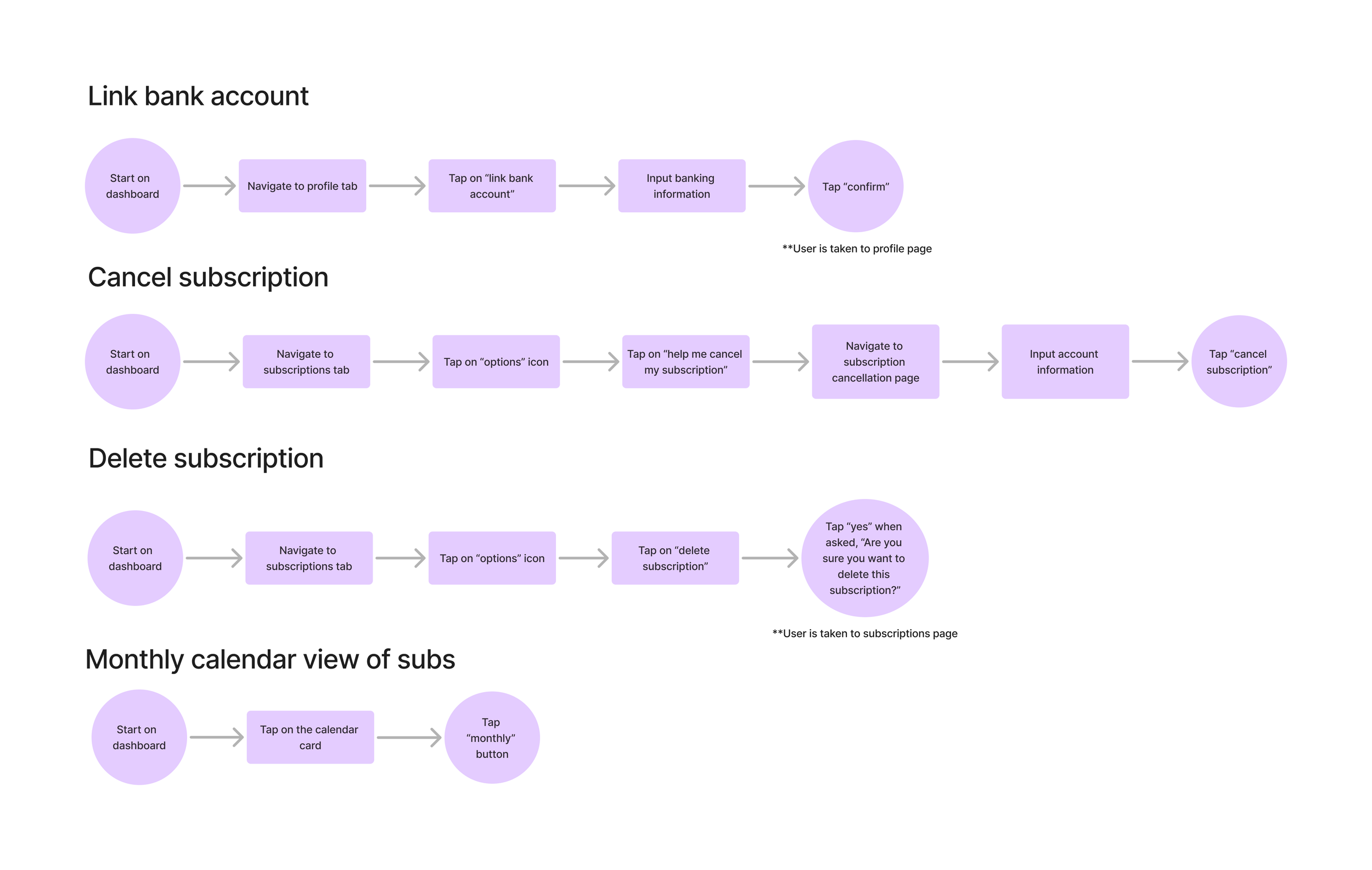
User flows
To ensure SubSmart’s success on mobile, I mapped out user flows based on the existing web platform
It became clear that while the web experience was functional, it lacked the intuitive touch needed for mobile users
Sketching
I sketched out the preliminary designs in order to guide the digital designing that would follow
-
![]()
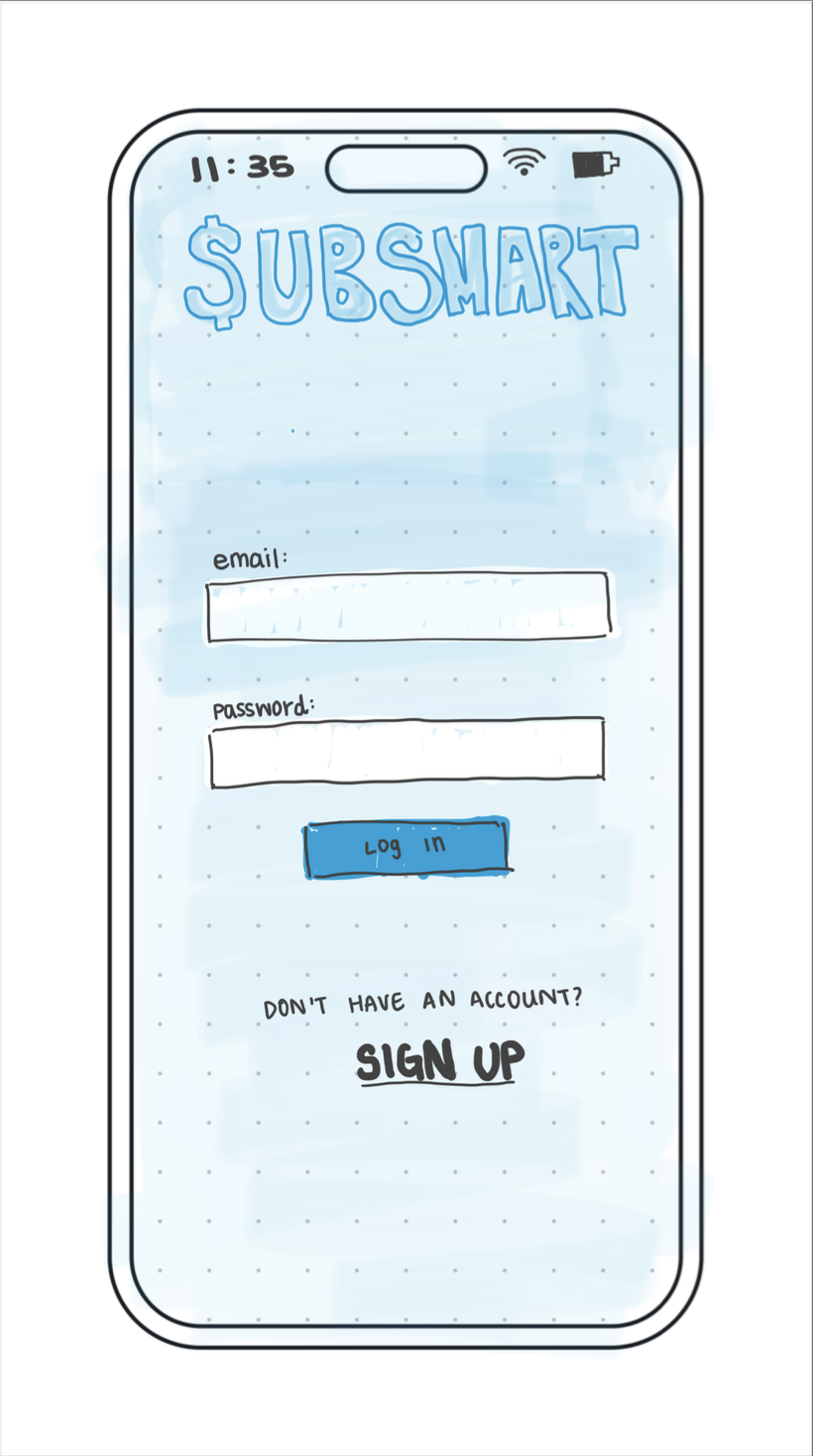
Log in
-
![]()
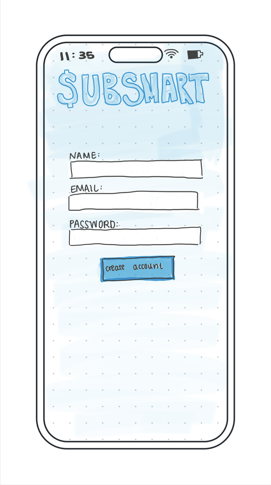
Sign up
-
![]()
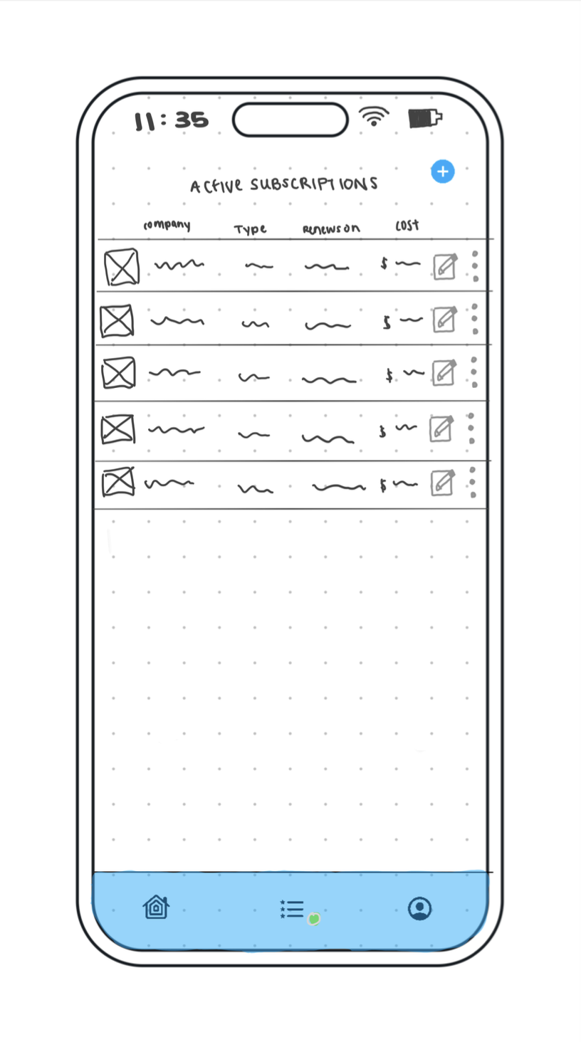
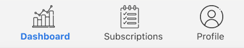
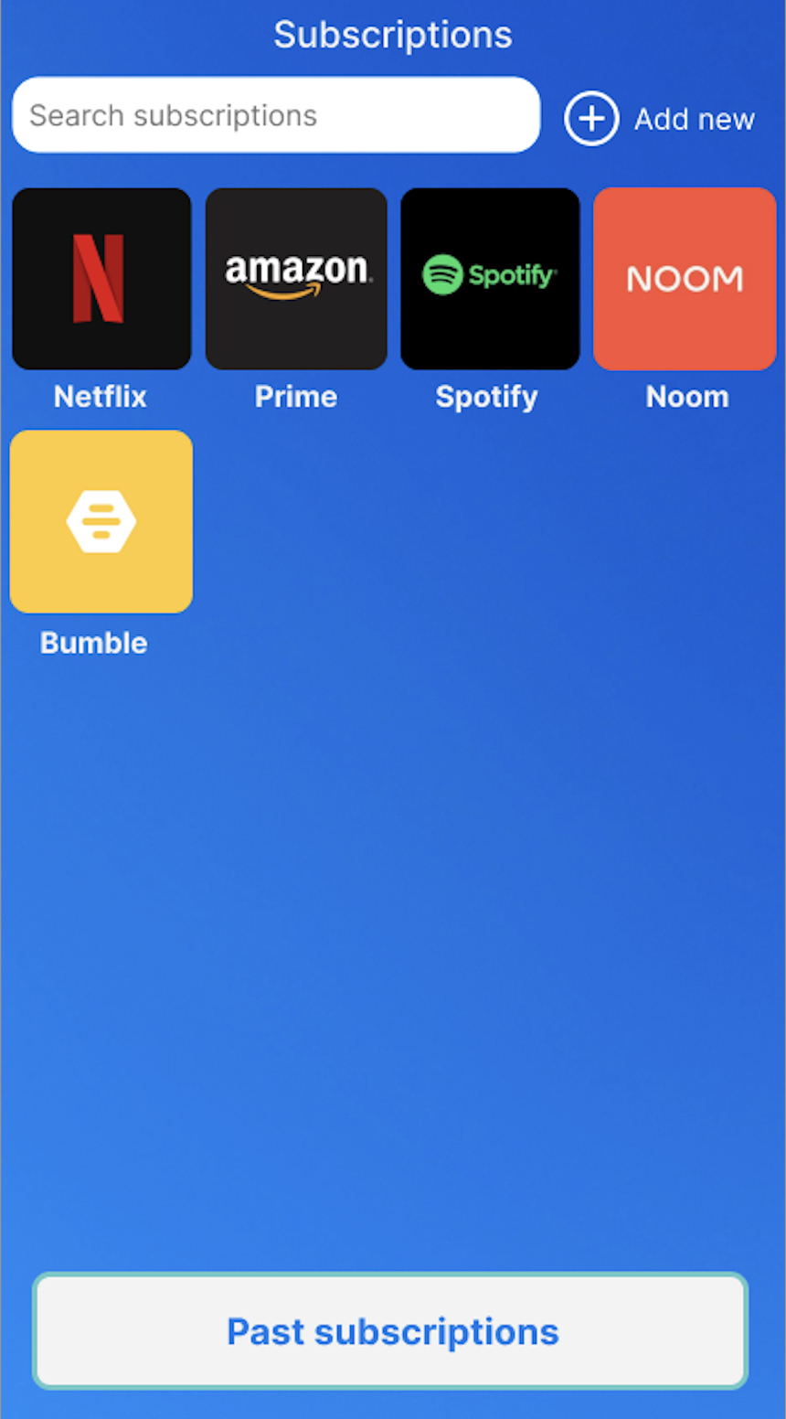
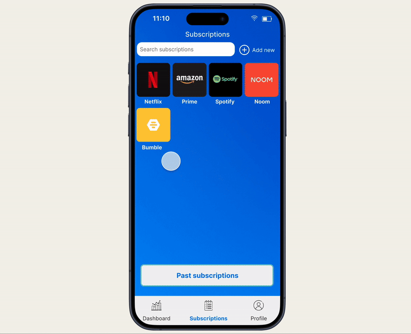
Subscriptions tab
-
![]()
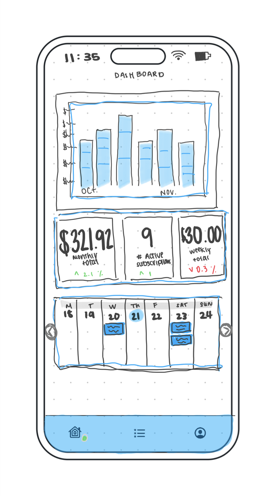
Dashboard
-
![]()
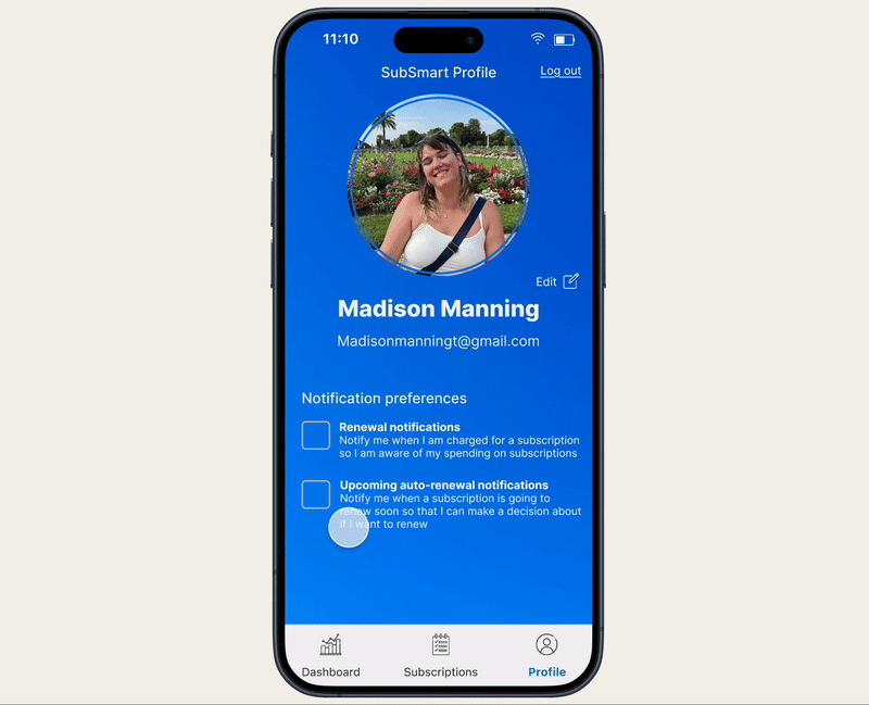
Profile tab
Lo-fi wireframing
I then started designing digitally and created low fidelity wireframes that I turned into a working prototype so that I could test users on the design’s functionality
Usability testing Round 1
I tested the lo-fi prototype on 5 people (moderated & in-person) for the first round of usability testing
This is the report that I wrote summarizing and organizing my findings from the first round of usability testing. I also proposed solutions to the problems that arose during testing
Findings
Theme 1 - Display of information
Multiple participants had trouble when asked to edit their subscription
Impact - Makes it hard for participants to edit their subscriptions
Evidence
1 participant had trouble finding the edit button
1 participant wanted to click directly on the text that she wanted to edit
Severity rating - Medium
Solution - Put the edit button/icon in the bubble with the subscription information instead of in the top right corner
Unclear which credit/debit card is linked to which subscriptions
Impact - This is important information for the user to know. If they are unaware which card is linked to which subscription this could lead to confusion and frustration
Evidence
1 participant made a comment about it being unclear which card is linked to each subscription and expressed that this would be important to him
Severity rating - Medium
Solution - On the subscription profile, add a section that shows which card is linked to this subscription
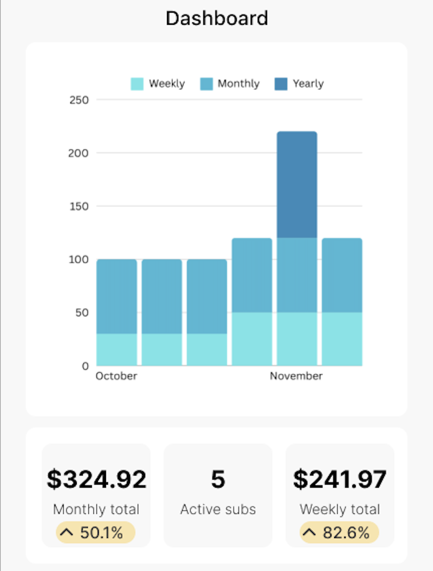
Unclear what the yellow bubble with statistic information is
Impact - confusing
Evidence
1 participant vocalized confusion about what these bubbles meant
When asked about them, 1 participant did not know what they were for
Severity rating - Medium
Solution - Find an alternative way to visually present information on the dashboard without these bubbles with stats
Theme 2 - Navigation
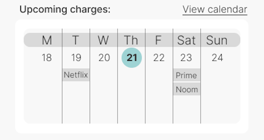
Confusion about the mini calendar
Impact - Led to confusion and trouble navigating the dash and calendar
Evidence
1 participant didn’t click to view the calendar, she just struggled with the mini one instead
1 participant wasn’t sure how he would go about viewing which subs were coming up on the 23rd of November
Severity rating - High
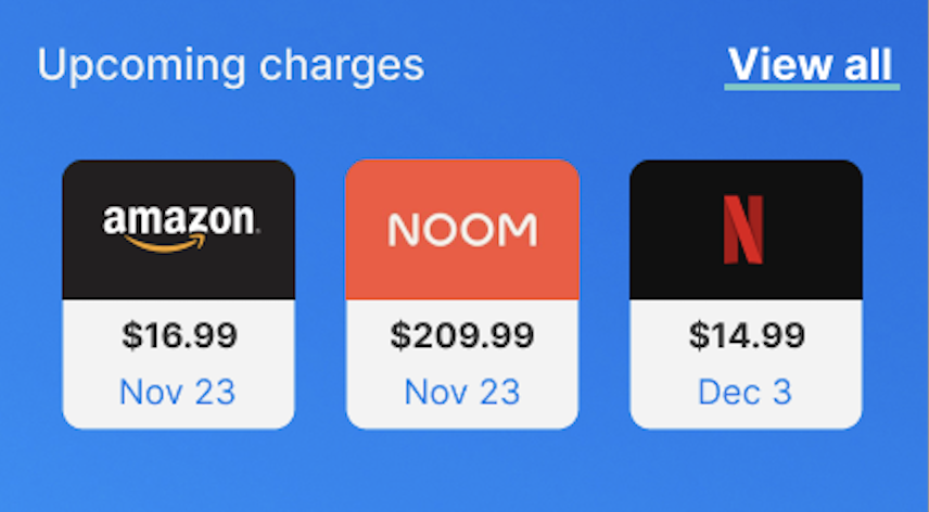
Solution - Get rid of the mini calendar view and add a button or card where the user can be directed to the full calendar view
Had some trouble navigating to the subscriptions tab in the toolbar
Impact - Confusion about major navigation elements
Evidence
1 participant wanted to click on the 5/active subscription bubble instead of the subscriptions button in the toolbar
1 participant had to look around the screen for a moment and didn’t seem super confident when he clicked on the button in the toolbar
Severity rating - High
Solution - add text to the toolbar icons to clarify what each button is

Theme 3 - Related to archiving/past subscriptions
Confusion about why one would need to archive a subscription after cancelling it
Impact - With the current design if people don’t archive the subscription after they cancel with the other party, the subscription would remain on SubSmart despite their cancellation on the subscription site
Evidence
“I don’t really understand why I would need to do that though”
Severity rating - High
Solution - When a user cancels their subscription, the subscription automatically goes to “past subscriptions” section
Unclear what “archiving” does
Impact - If it is unclear what the user would be doing by archiving, they probably won’t use this feature and would leave cancelled subs listed on SubSmart
Evidence
1 participant provided suggestions on how to make the archiving process more clear
“I don’t know why I would archive it”
Severity rating - High
Solution - change to “past subscriptions” instead of “archived subscriptions”
Other suggestions
Add a “subscription history” section where users can view their past charges
Maybe add a category or tag of some kind to sort - entertainment, financial, fitness, housing, utilities
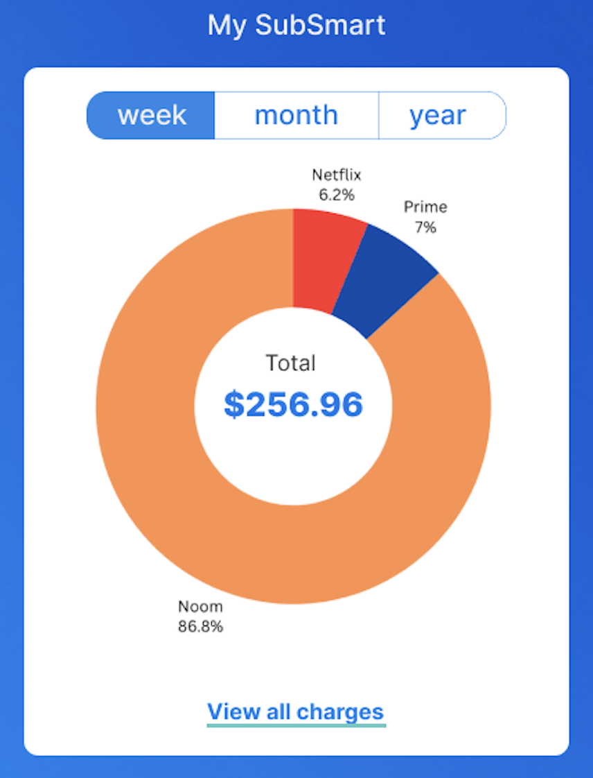
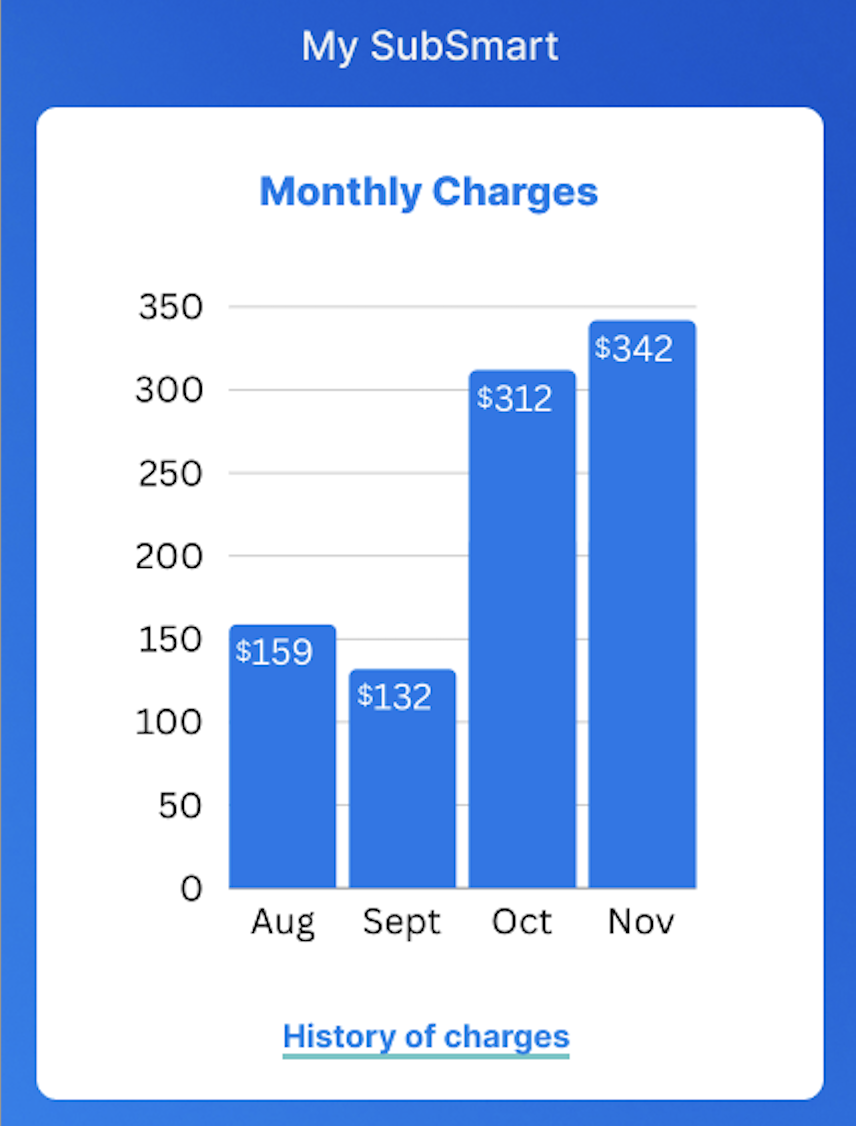
Pie chart on the dashboard to show people where there money is going each week/month
Should be able to toggle between week/month/year
On the dash, group the like stats together - currently the totals are separated by the number of active subs
Hi-fi wireframing
With feedback from usability testing in mind, I iterated on the design, and created a high-fidelity prototype that emphasized user needs
Usability testing Round 2
I tested the hi-fi prototype on 5 people (moderated & in-person) for the second round of usability testing
This is the report that I wrote to summarize my findings from the second round of usability testing. I also proposed solutions to the problems that arose during testing
Findings
Multiple participants thought that their weekly view of the dashboard seemed expensive because of the yearly Noom charge
Impact - Confuses participants and makes them anxious about their subscription spending
Evidence
1 participant exclaimed that she was spending a ton
1 participant expressed that he thought the weekly sum was too high and seemed confusing
Severity rating - Medium
Solution - Change the way that spending data is visually displayed on the dashboard

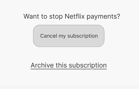
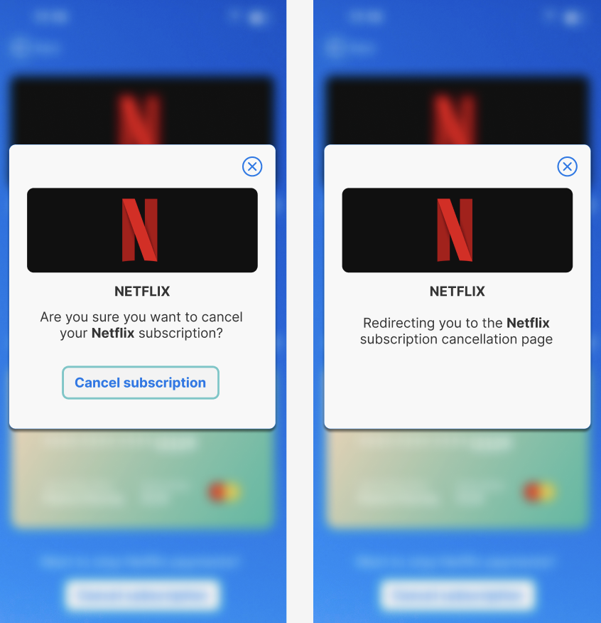
Cancelling the subscription in the SubSmart app wouldn’t cancel the subscription with the subscription service
Impact - Most important element of the app is being able to manage and cancel your subscriptions with ease so have to have this flow better
Evidence
1 participant expressed confusion about how the subscription would be cancelled in both places
Severity rating - High
Solution - To cancel the subscription it should redirect the user to the manage subscription section of the subscription site

Suggestions
Make the toolbar icons smaller
On the history of charges page - highlight in blue the amount being charged instead of what is currently highlighted
Touch points on the calendar are small
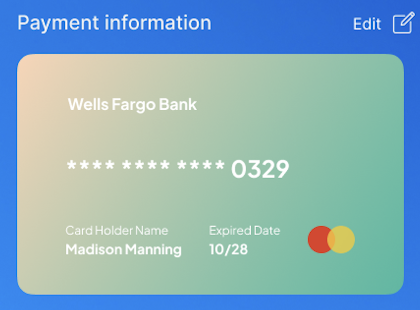
Change layout of payment info - maybe like apple wallet? Layered cards?
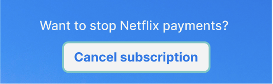
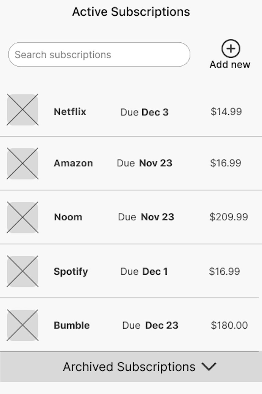
Final iteration
Finally, with feedback from the usability tests in mind, I went through another round of iteration to make final changes and create the final design
-
![]()
Dashboard
-
![]()
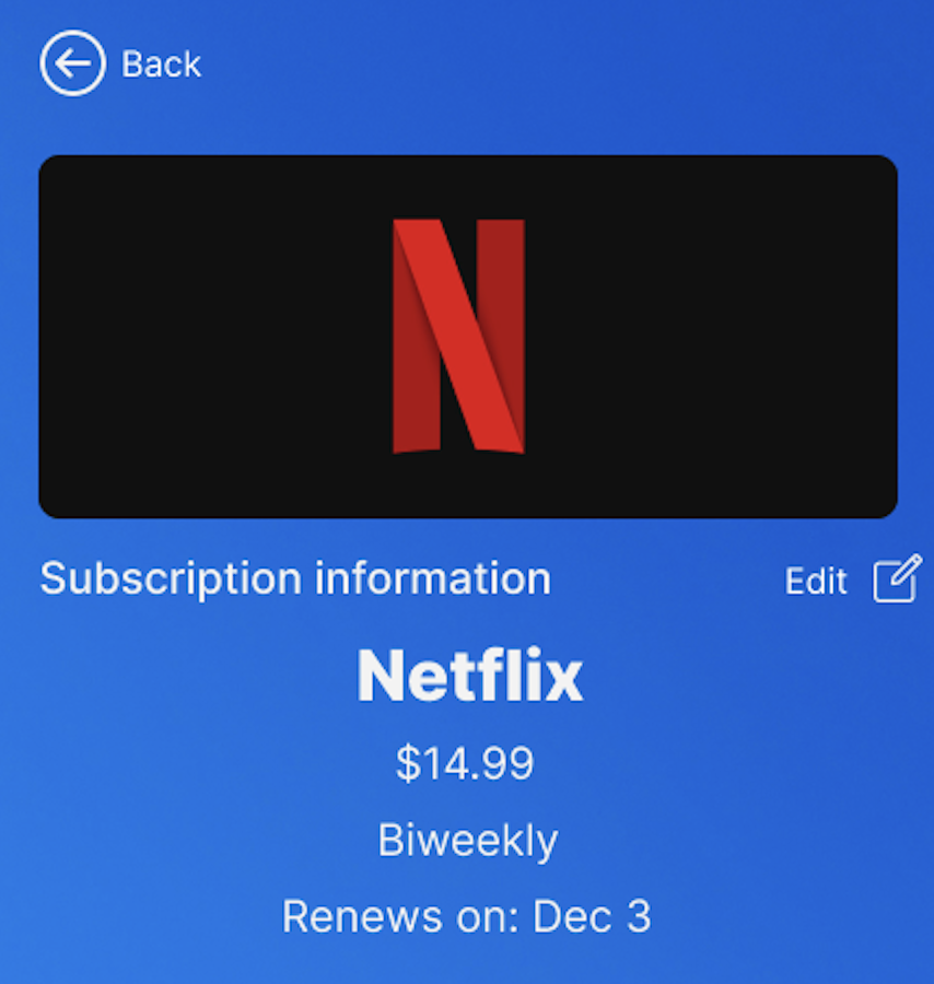
Cancel Netflix Subscription
-
![]()
Profile Page

Conclusion
Through a user-centered research and design approach, SubSmart transformed into a tool that users can rely on to simplify managing their finances. Now via their mobile devices!
Throughout this project I honed my ability to translate research findings into design solutions. The experience reinforced my passion for UX research and the role it plays in influencing design decisions and crafting user-centered designs.
This case study shows my ability to employ different research methodologies, my commitment to understanding user needs, and my ability to iterate based on my insights and findings.